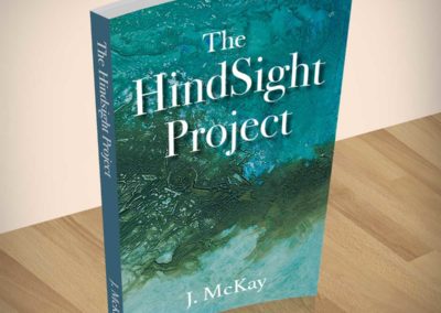
The Hindsight Project

This project began with an enquiry from author J McKay about licensing one of Glenda’s abstract paintings to use as part of a book cover design.
We agreed licensing terms and were also commissioned to design the book cover and other supporting material for the launch of the book.
With the added bonus of a collaborative exhibition after the book launch, this was an thoroughly enjoyable project from start to finish.
After buying a painting from Glenda I realised she was a very talented graphic designer as well. She expertly converted the painting to a book cover and from there to promotional materials.
Glenda made everything seem so easy, but that was part of her skill and her attention to detail. I had no design experience and she had all the expertise, but it felt more collaborative than that.
She was lovely to work with while being completely professional and reliable throughout. If I was planning another book I would go back to Glenda for the design work without hesitation.
We arranged to have the painting professionally scanned in order to capture all the intricate details of the colour and texture. The painting was then used as the basis for the background of the book cover.
Sampling colours from the painting, we chose a teal colour for the spine and translucent shade of the same colour as an overlay to darken and unify the front, allowing the white text to stand out.
Different portions of the painting were selected for front and back with a white translucent layer placed on the back cover to ensure the text was not lost.


Marketing Support
We created a poster to issue to bookshops in support of the book launch and had a version printed with ‘local author’ for events in the region. We also made these up as strut cards which are ideal for book signings or for bookshops displays.


Branding package
As J McKay was a self published author, she asked us to develop a simple brand identity for her publishing company, along with a suite of stationery.
We designed a brand logo for the publishing company using colours sampled from the painting.
The font had to be simple as a plain text version had to be legible on the spine of the book.
We created compliments slips, A4 and A5 letterheaded paper and provided an A4 Word document template using the same layout.

Collaboration
There was an added bonus at the end of this project which was the chance to put the book and painting together in an exhibition titled ‘Spinning a Yarn’ at The Yellow Door Gallery in Dumfries. The exhibition invited writers, makers and artists to pair up and work collaboratively and we felt that our time working together was an original take on this brief.
The exhibition gave me an opportunity to talk a little about the painting and for the author to talk about why she was drawn to it for her book cover.